ShopDreamUp AI ArtDreamUp

Deviation Actions


Description
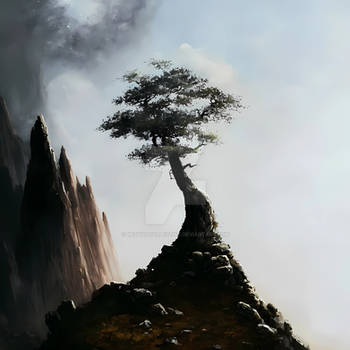
Made that one a while ago and stumbled on it while I was searching for some other file. I did some little rework and here it is. I'm not sure about the empty area on the left but everything I've tried didn't look good. The longer I look at it, the more I like it (I'm talking about the empty area).
But I'm open to any ideas, so don't hesitate to leave a comment.")
---
credit:
 model by *faestock [link]
cliff by ~mindCollision-stock [link]
tree by ~markopolio-stock [link]
mountains, sky and flowers by =night-fate-stock [link] [link] [link]
moss brushes by *redheadstock [link]
________________
Copyright © Blaumohn
Do not use without my written permission.
But I'm open to any ideas, so don't hesitate to leave a comment.
---
credit:
________________
Copyright © Blaumohn
Do not use without my written permission.
Image size
900x602px 424.37 KB
© 2010 - 2024 Blaumohn
Comments153
Join the community to add your comment. Already a deviant? Log In
Fantastic digital piece! I apologize in advance if I use any incorrect terminology, or comment on some odd things. As a near-Traditionalist-purist, I honestly have no experience at all in the digital field, but I'll do my best to critique this, to the best of my abilities ;D
First off, I really love the imagery here. While I feel guilty for immediately thinking "Cameron's Avatar!" upon seeing this, it's clear that you took your own Romantic, fantastical spin to that striking bit of scenery. Those red flowers on the island are a wonderful touch. They pop from the island, but not in a way that's distracting at all from the rest of the piece.
Similarly, the background is very much well done. It's detailed enough for clarity's sake, but it isn't so overwrought that your intended subject matter would get lost in the mix. Very tastefully done. I'd have to say the same about the model/figure. If anything, I would have to say she's a bit too brightly lit for my taste, but that's my personal aesthetic, so take that as you may.
I think you did an excellent job with the color scheme for the most part. It definitely is a great display of those middle tones, if that makes sense at all. It's very earthy, but it keeps that airyness that would be integral to an image like this. The purples really help with that. I would have to say, however, that it's a bit TOO heavy on those warm colors. I'd have to make a similar comment on the island/tree, in that I feel that the green is a bit TOO vibrant for the rest of the image, if that makes sense. I feel that a duller, more subdued hue would better fit the rest of the image. Again, that is my personal aesthetic, so take that as you will.